Website notifications have become commonplace. We see them in eCommerce, membership communities, and social media. They’re hard to escape.
And they’re also important for users. Notifications provide details regarding orders, messages, and other account information.
Thus, it’s interesting to see how notification UIs are evolving. Designers are using their creativity and adding personality. They’re proving that notifications can have both form and function.
With that, let’s take a look at eight unique notification UIs. They use CSS and (in some cases) JavaScript to go beyond the basics.
Neon Notification System with hover Effects by CleverYeti
This notification UI is perfect for websites using dark mode. The look is elegant while also being easy to digest. We’ll give bonus points for including some smooth CSS animation effects.
See the Pen Neon notification system by CleverYeti
Vertical Timeline Notifications by Alina N.
Here’s a neat way to organize multiple notifications. This timeline layout makes each item stand out. The spacing between entries keeps things easy to follow. The search field is also a welcome addition.
See the Pen Vertical Timeline – Notifications by Alina N.
Notification Badge Animation by Valery Alikin
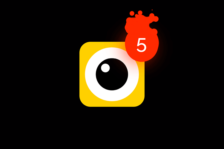
Want to add an element of fun? This bright little UI resembles a “Minions” character. And if the colors don’t get your attention, the splatter animation will do the job.
See the Pen Notification Badge Animation by Valery Alikin
Project Notifications by Landon Messmer
Perhaps the “bell” icon is a bit overused. But in this case, it’s more about what’s inside. This notifications panel is beautiful and functional. It features a clean look and some handy features.
See the Pen Project Notifications by Landon Messmer
Error, Success, Warning, and Alert Notifications by Swarup Kumar Kuila
This notification UI brings a simple yet high-tech aesthetic. With bright colors and simple animation, it’s sure to draw attention. It’s powered by CSS, with an assist from the popular Font Awesome icon library.
See the Pen error, success, warning and alert Messages by Swarup Kumar Kuila
Info, Warning, and Alert Site Components by Dom Jay
These notification components are a fit for long-form content. Use them to display important details in an online course. Or as a call-out box within a blog post. Alerts aren’t just for user-specific info, after all.
See the Pen Site Component – Info/Warning/Alert by Dom Jay
Success, Error, Alert Flat Notifications by AbrarK
Click a button and watch as a colorful notification appears. This presentation uses a flat style reminiscent of Facebook and other popular services. It also features some slick animation.
See the Pen Flat Notify by AbrarK
Pop-Up Social Media Notification by Nooray Yemon
Here’s a highly stylized take on a notification UI. It shows that notifications can go beyond utility. They can also be a branding opportunity.
See the Pen Pop up social feed notification by Nooray Yemon
Serve Notice with These Awesome UI Examples
Notification UIs are now a staple of web design. They’re impacting all types of websites. Odds are that you’ll need to consider them in an upcoming project.
We can certainly stick with a generic look. But there’s an opportunity to do much more. CSS and JavaScript enable us to create a unique user experience. The examples above are just the tip of the iceberg.
Want to see even more outstanding notification UIs? Check out our CodePen collection!


