Build custom mobile apps without having to code with this simple app (TechRepublic Academy)
- How to build a website with WordPress and what are the best plugins to use: WordPress Web Design Tutorials: How to build a website with WordPress and what are the best plugins to use. Building a website with WordPress is an excellent choice due to its versatility, ease of use, and a vast array of plugins that enhance functionality. Here’s a comprehensive guide to building a WordPress website, along with recommendations for the best plugins.
- The Most Important Stages and Plugins for WordPress Website Development: Developing a WordPress website requires careful planning, execution, and optimisation to ensure it is functional, user-friendly, and effective. The process can be broken into key stages, and each stage benefits from specific plugins to enhance functionality and performance. Here’s a detailed guide to the most important stages of WordPress website development and the essential plugins for each stage.
- What are the most powerful Tools for SEO in WordPress?: Powerful SEO Tools for WordPress: Search Engine Optimisation (SEO) is essential for improving your WordPress website’s visibility in search engines. Here are the most powerful tools to optimise your site effectively:
- How to add shipping modules in CubeCart: Step 1: Log in to Your CubeCart Admin Panel: Open your web browser and navigate to your CubeCart admin login page. Enter your username and password to log in.
Step 2: Navigate to the Extensions Section: Once logged in, go to the left-hand menu and click on Manage Extensions. From the dropdown, select Extensions.
Step 3: Find Shipping Modules: In the Extensions section, locate the Shipping tab to view available shipping modules. You can browse through the list or use the search function to find a specific module. - Gathering domain and IP information with Whois and Dig: In the digital age, understanding the intricacies of domain and IP information is essential for anyone navigating the online landscape. This article explores two powerful tools—WHOIS and DIG—that help gather valuable insights about websites and their underlying infrastructure. Whether you’re a cybersecurity professional, a web developer, or simply curious about online resources, you will learn how to effectively utilize these tools, interpret their outputs, and apply this knowledge to real-world scenarios.
- What are the best WordPress Security plugins and how to set them up the best way: Read a comprehensive guide on the best WordPress security plugins and how to set them up to ensure optimal protection for your WordPress site.
- Will a headland provide enough shelter?
- Learn How To Purchase Your Own Domain Name with Fastdot.com: Open your web browser and go to Fastdot.com. Navigate to the Domains section, either from the homepage or from the main navigation bar.
Step 2: Search for Your Desired Domain Name: In the domain search bar, type the domain name you want to purchase. Fastdot supports a wide range of domain extensions (TLDs), such as .com, .net, .org, .com.au, and many others. Click the Search Domain button. The system will check the availability of your desired domain name.
Why mobile first makes sense in today’s digital landscape
Today more than 2 billion people access the internet from their smartphone. Some analysts predict by 2025 this may be how more than 70% of internet users operate.
Since 2012, smartphone sales have drastically outpaced desktop computer sales. The mobile game market is outselling PC and consoles combined. There is no shortage of stats you can find on the internet to drive home just how important capturing and captivating mobile users are. But, there is more to the story than just the sheer volume of devices in consumer hands.
Google’s algorithms favor mobile-friendly websites. In fact it is so important to the search giant they have even created a site that can test your website’s mobile friendliness for you.
For a majority of applications, organic traffic via search engines is a key ingredient to long-term success. Paying attention to Google’s algorithms is one of the best ways to ensure discoverability. And since mobility is high on that list, by extension a mobile-first strategy gives you a competitive advantage.
Content is the undisputed king
When going mobile first, it’s important to remember that content is king. Designers should focus on surfacing exactly the content a user needs and nothing more. Extra elements tend to distract from the user’s focus on the current task, and productivity suffers when screen real estate is limited.
So, while it is typical to show all the options on a desktop view, well-designed mobile applications use context to decide what to show when and just as importantly, what not to show.
It doesn’t mean mobile users can’t get to all those fine-grained options, it just means those options that don’t generally support the main use case are hidden behind low-profile UI constructs like collapsible menus and accordions.
Mobile-first design best practices
Start with your users in mind
Your application is solving a problem, and if your mobile design does not allow the user to solve that problem quickly and efficiently, it’s a missed opportunity.
Hierarchy matters
It should be clear from how your application is presented to the user what’s most important at that particular moment. If you are on a mobile banking site to transfer funds, you expect to see how much money you have front and center.
Simple is better
Reduce the number of links in your navigation when possible, and use fewer pages that take advantage of vertical scrolling. For portrait apps, don’t divide the screen into more than two columns. And consider larger fonts and wide, clean borders.
Clear call to action
Each screen should have a clear call to action (CTA). It should be bright, bold and consistent. Google’s Material Design has a great construct for this called a FAB, or floating action button, if you’d like some guidelines.
Don’t make users wait
Check your load times. One study suggests 79% of shoppers are unlikely to use a site again if the performance is poor. Compress images where you can, and utilize techniques like “lazy loading” to improve your time-to-glass.
SEE: Load testing vs. stress testing: What are the main differences? (TechRepublic)
Mobile-first application inspiration
If you’re looking for some inspiration, consider checking out these exemplary mobile sites. Hopefully, these examples will have you considering whether a mobile-first approach might be the right approach for your next digital endeavor.
Pollen
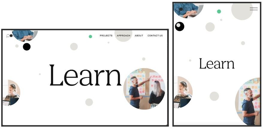
It should come as no surprise that Pollen has a slick mobile experience when you take a look at what they do. Pollen is a design and UX digital studio. The site loads quickly, makes great use of white space and does an excellent job of adapting the navigation menu based on whether the site is running on desktop or mobile (Figure A).
Figure A

TurboTax
Who says taxes are boring? The TurboTax application makes heavy use of CTAs and enables a complicated workflow in a context-aware, mobile-first approach (Figure B).
Figure B

Shopify
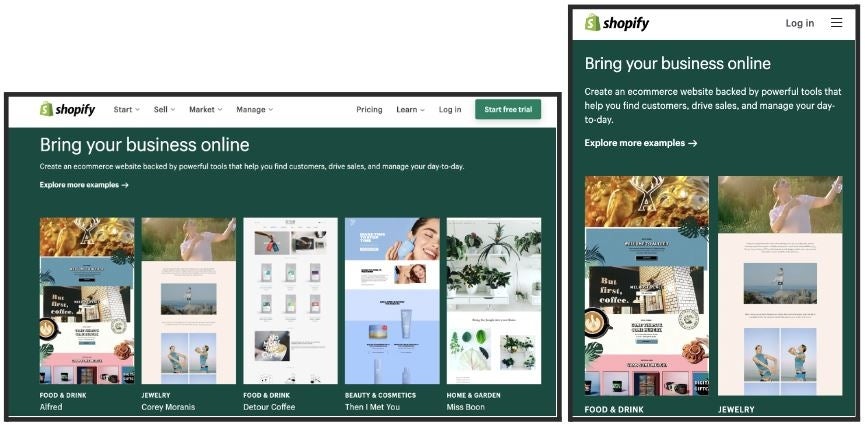
As a leader in e-commerce, Shopify needs a first-rate user experience regardless of where customers run across them. Here, we see a great example of how Shopify chose to simplify grid layouts on mobile (Figure C).
Figure C

Mobile-first design prioritizes user experience
While more common in B2C apps, in recent years many B2B organizations are also taking advantage of mobile-first strategies. Because mobile-first development prioritizes the smallest screen, it effectively shifts focus and tough conversations around core functionality left.
By starting with deciding how an app will look and operate on a smartphone before moving on to larger screens and devices, developers, designers and product owners quickly get alignment on what matters to users and customers.
Learn more about mobile app development with these resources from TechRepublic Academy:


