<img src="" alt="">
That’s it! All we need is an <img> tag. Everything else will be done in CSS.Here’s how it’s going to work. We are going to explore three different effects that are not linked to each other but might borrow a little from one another. You don’t need to read the entire article in one sitting. Actually, I suggest reading one section at a time, taking time to understand the concepts and what the underlying code is doing before moving on to another effect.
Table Of Contents

CSS 3D Shine
For the first effect, we are going to add a shine animation to the image, as well as a slight rotation when hovered.
See the Pen [3D Shine effect on hover](https://codepen.io/t_afif/pen/VwEJqKV) by Temani Afif.
See that? The image starts slightly askew but then straightens out on hover while a shine reflects off the surface. This is a neat way to add a bit of realism to a UI without going overboard.The first thing I did in that demo was add a rotation to the image in CSS:
img { transform: perspective(400px) rotate3d(1, -1, 0, 8deg);
}
img:hover { transform: perspective(400px) rotate3d(1, -1, 0, -8deg);
}
rotate3d allows us to define an axis for the image to rotate around. I won’t dig into the math details, but to get a diagonal axis, we make the z-axis equal to 0 and use 1 or -1 for both the x-axis and y-axis.Then, we use the perspective property to add a little imbalance to the image. There is no particular logic behind the 400px value or the 8deg applied to the rotation, but I’ve found that a small angle combined with a big perspective gives a good result. Feel free to edit them, and maybe you will find better values for your specific use case.We can simplify this! To avoid repetition on :hover, we can use a CSS variable to update the sign of the angle on hover. That way, there’s no need to re-write the entire declaration simply to change 8deg to -8deg.
img { transform: perspective(400px) rotate3d(1, -1, 0, calc(var(--i, 1) * 8deg));
}
img:hover { --i: -1;
}
Notice how I’m using calc() in there. By multiplying the degree value by 1 (defined by the --i variable), we get 8deg by default. Then we swap that out by changing 1 to -1 in the hover ruleset and let calc() do the heavy lifting.That’s fun! But it gets even more interesting when we start working on the shine. An intuitive approach to making a shine might be to rely on an overlay that we place above the image. But remember, we’re working with nothing but a single <img> element, and an overlay would require more markup.You might also be tempted to reach for a pseudo-element instead. But that’s not going to work here, unfortunately, because they won’t work with the <img> tag.What we are going to do is “fake†it with a CSS mask and an animated gradient. I am saying “fake†because, in reality, the image you see is partially transparent. On hover, the transparency is updated to create a shiny effect.I know it’s not easy to grasp, but if you consider that our background is black — and, yes, that is part of the trick! — making the image partially transparent is similar to making the image darker. And when the image is hovered, we adjust the transparency to brighten it up.Here is a simplified example using opacity to better understand what I mean:
See the Pen [Opacity transition](https://codepen.io/t_afif/pen/RwqNjeo) by Temani Afif.
That’s the basic idea. Now, instead of opacity, we are going to use mask with a linear-gradient()
/* Diagonal gradient that is opaque * in the center and semi-transparent * on both sides.
*/
mask: linear-gradient(135deg, #000c 40%, #000, #000c 60%);
When masking in CSS, the color doesn’t matter considering the default mask-mode. All that matter is the alpha channel that will define the level of transparency. In our case, the diagonal part is opaque, while the sides are partially transparent. #000c is equivalent to rgb(0 0 0 / 80%).
See the Pen [Adding the gradient mask](https://codepen.io/t_afif/pen/VwVYrVa) by Temani Afif.
The gradient is super subtle because we only reduced the transparency a little. That’s a good thing because we don’t want the user to notice that the image is partially transparent by default.The next step is to animate that gradient. We increase its size to the point where the opaque center is out of view. Then we move it from the top-left corner of the image to the bottom-right corner:
img { mask: linear-gradient(135deg, #000c 40%, #000, #000c 60%) 100% 100%/ /* initial position, bottom-right */ 240% 240%; /* width and height */
}
img:hover { mask-position: 0 0; /* Move to the top-left on hover */
}
Check it out; we have a nice shine on hover!
See the Pen [Adding the hover effect](https://codepen.io/t_afif/pen/eYQmebX) by Temani Afif.
Cool, right? Now let’s combine that shine above with the 3D rotation to get the full effect.
img { transform: perspective(400px) rotate3d(1,-1,0,calc(var(--i,1)*8deg)); mask: linear-gradient(135deg,#000c 40%,#000,#000c 60%) 100% 100%/240% 240%; transition: .4s; cursor: pointer;
}
img:hover { --i: -1; mask-position: 0 0;
}
One HTML element and a few lines of CSS are all we needed to make that happen. Here is a figure to illustrate the different values used inside the mask:
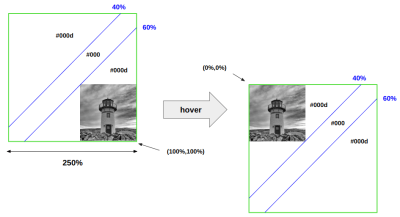
The green box illustrates the gradient where the blue lines define the color stops we used. Initially, it’s placed at 100% 100%, and on hover, we slide it to 0 0. The slide effect will move the diagonal part of the gradient (the opaque part) along the image to create the shine effect.Here is the full demo again. I’m even including a second variation for you to tear apart and investigate how it works.
See the Pen [3D Shine effect on hover](https://codepen.io/t_afif/pen/VwEJqKV) by Temani Afif.
CSS 3D Parallax
We normally think of “parallax†as this thing we use for interesting scrolling effects where elements change position at different speeds. But we can use it to make a slick hover effect on our image too.
See the Pen [3D parallax effect on hover](https://codepen.io/t_afif/pen/qBJyXNy) by Temani Afif.
Like the shine effect we made in the last section, we start with a slightly skewed image that straightens out on hover. But, instead of applying a shine, we’re sliding the image over a smidge with a transition to make it look like the focal point rotates with the image, adding a sense of depth to it.You might think we need to stack two versions of the same image to pull this off, but not at all! The effect is done with a single image and a few lines of CSS for the “fake†parallax effect. Yes, I’m calling this a “fake†effect because it’s not really a parallax implementation but a combination of movements that trick your brain into thinking it is! If you want to see “real†parallax at work, this pen from Sladjan is a great example.The image is very important here. For a perfect illusion, consider an image where the main element is placed at the center, and the background is uniform. That might be a bit of a limitation as far as this effect goes, so it might not be the best approach for every image.The image rotates and changes perspective on hover, just like the shine effect in the last section. This time, however, we’re rotating along the y-axis (rotateY()) instead of all three axes (rotate3d()).
img { transform: perspective(400px) rotateY(8deg);
}
img:hover { transform: perspective(400px) rotateY(-8deg);
}
We accomplish the sliding movement with a combination of CSS clipping and translation. This is the trickiest part of the effect. Here is a simplified demo to illustrate the main idea:
See the Pen [Moving the image inside a box](https://codepen.io/t_afif/pen/QWJweZP) by Temani Afif.
We have an image inside a box with a green border representing the clipped area. The clipped area is square, and the image overflows the right edge a bit. On hover, we slide the image to the left (using transform: translateX()) while the clipped area remains in place.If we hide the part of the image that overflows the clipped area (overflow: hidden) and add the same rotation we made in the last section, we get the “fake†parallax effect we want:
See the Pen [Adding the rotation + the overflow](https://codepen.io/t_afif/pen/VwVYoqr) by Temani Afif.
But that demo uses an extra <div> element to pull it off. Our challenge is to do the same thing without that element. That’s where clip-path is really helpful:
img { --f: .1; /* parallax factor (the smaller, the better) */ --_f: calc(100 * var(--f) / (1 + var(--f))); width: 250px; /* image size */ aspect-ratio: calc(1 + var(--f)); object-fit: cover; clip-path: inset(0 var(--_f) 0 0); transition: .5s;
}
img:hover { clip-path: inset(0 0 0 var(--_f)); transform: translateX(calc(-1 * var(--_f)))
}
The --f variable controls the effect, describing how much the image should move. You will notice that I am using it to calculate an aspect-ratio that is slightly greater than 1 to create a non-square image that we later clip to get a square image. --_f defines the portion we must cut from the image to get a 1:1 square ratio.
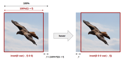
clip-path values change when the image is in a hovered state. (Large preview)The clip-path defines the clipped area, and we need that area to remain fixed. That’s why we added a translation on hover to move the image in the opposite direction of the clip-path.
See the Pen [Clip-path + translation](https://codepen.io/t_afif/pen/PoxwMry) by Temani Afif.
We add the rotation to the mix, and the effect is perfect:
img { --f: .1; /* parallax factor (the smaller the better) */ --r: 10px; /* the radius */ --_f: calc(100%*var(--f)/(1 + var(--f))); --_a: calc(90deg*var(--f)); width: 250px; /* image size */ aspect-ratio: calc(1 + var(--f)); object-fit: cover; clip-path: inset(0 var(--_f) 0 0 round var(--r)); transform: perspective(400px) translateX(0px) rotateY(var(--_a)); transition: .5s;
}
img:hover { clip-path: inset(0 0 0 var(--_f) round var(--r)); transform: perspective(400px) translateX(calc(-1*var(--_f))) rotateY(calc(-1*var(--_a)));
}
I’ve rounded the edges of the clipped area slightly to make the effect a little more fancy. If you’re wondering why I didn’t use the border-radius property, it’s because the property doesn’t work well with clipped areas. Luckily, clip-path accepts a round value to get the same sort of rounded corners.That’s it! We’re actually done with this neat hover effect on our image.
See the Pen [3D parallax effect on hover](https://codepen.io/t_afif/pen/qBJyXNy) by Temani Afif.
You can adjust the parallax factor and the rotation angle, then work with the best image possible for using it in your own work. If you do use it, please show me your demos in the comments!
CSS 3D Rotation
For this last demo, we will add depth to the image and transform it into a 3D box.
See the Pen [3D images with hover effect](https://codepen.io/t_afif/pen/yLRRBKj) by Temani Afif.
For this one, I will skip the rotation part because it’s the same as what we just made in the last demo. Let’s focus instead on the 3D part, using the outline and clip-path properties. The following image illustrates how they come together to form a 3D box.
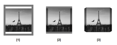
Here’s how that works. First, we add some padding to the top and the bottom of the image and apply an outline that is semi-transparent black.Second, we apply a negative outline-offset so that the outline covers the image on the left and right sides but leaves the top and bottom alone:
img { --d: 18px; /* depth */ padding-block: var(--d); outline: var(--d) solid #0008; outline-offset: calc(-1 * var(--d));
}
Notice that I have created a variable, --d, that controls the thickness of the outline. This is what gives the image depth.The last step is to add the clip-path. We need a polygon with eight points for that.
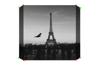
The red points are fixed, and the green points are ones that we will animate to reveal the depth. I know it’s far from a 3D box, but this next visual, where we add the rotation, gives a better illustration.
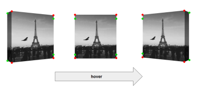
Initially, the image is rotated with some perspective. The green points on the right are aligned with the red ones. Thus, we hide the outline on that side to keep it visible only on the left side. We have our 3D box with the depth on the left.On hover, we move the green points on the left while rotating the image. Halfway through the animation, all the green points are aligned with the red ones, and the rotation angle is equal to 0deg, hiding the outline and giving the image a flat appearance.Then, we continue the rotation, and the green points on the right move while the left ones remain in place. We get the same 3D effect but with the depth on the right side.Bear with me because the next block of code is going to look really confusing at first. That’s due to a few new variables and the eight-point polygon we’re drawing on the clip-path property.
@property --_l { syntax: "<flength>"; initial-value: 0px; inherits: true;
}
@property --_r { syntax: "<length>"; initial-value: 0px; inherits: true;
} img { --d: 18px; /* depth */ --a: 20deg; /* angle */ --x: 10px; --_d: calc(100% - var(--d)); --_l: 0px; --_r: 0px; clip-path: polygon( /* The two green points on the left */ var(--_l) calc(var(--_d) - var(--x)), var(--_l) calc(var(--d) + var(--x)), /* The two red points on the top */ var(--d) var(--d),var(--_d) var(--d), /* The two green points on the right */ calc(var(--_d) + var(--_r)) calc(var(--d) + var(--x)), calc(var(--_d) + var(--_r)) calc(var(--_d) - var(--x)), /* The two red points on the bottom */ var(--_d) var(--_d),var(--d) var(--_d) ); transition: transform .3s, --_r .15s, --_l .15s .15s;
} /* Update the points of the polygon on hover */
img:hover{ --_l: var(--d); --_r: var(--d); --_i: -1; transition-delay: 0s, .15s, 0s;
}
I’ve used comments to help explain what the code is doing. Notice I am using the variables --_l and --_r to define the position of the green points. I animate those variables from 0 to the depth (--d) value. The @property declarations at the top allow us to animate the variables by specifying the type of values they are (<length>).Note: Not all browsers currently support @property. So, I’ve added a fallback in the demo with a slightly different animation.After the polygon is drawn on the clip-path property, the next thing the code does is apply a transition that handles the rotation. The full rotation lasts .3s, so the green points need to transition at half that duration (.15s). On hover, the polygon points on the left move immediately (0s) while the right points move at half the duration (courtesy of a .15s delay). When we leave the hovered state, we use different delays because we need the right points to move immediately (0s) while the left points move at half the duration.What’s up with that --x variable, right? If you check the first image that I provided to illustrate the clip-path points, you will notice that the green points are slightly shifted from the top and bottom edges, which is logical to simulate the 3D effect. The --x variable controls how much shifting takes place, but the math behind it is a bit complex and not easy to express in CSS. So, we update it manually based on each case until we get a value that feels right.That gives us our final result!
See the Pen [3D images with hover effect](https://codepen.io/t_afif/pen/yLRRBKj) by Temani Afif.
Wrapping Up
I hope you enjoyed — and perhaps were even challenged by — this exploration of CSS 3D image effects. We worked with a whole bunch of advanced CSS features, including masks, clipping, gradients, transitions, and calculations, to make some pretty incredible hover effects for images that you certainly don’t see every day.And we did it in a way that only needed one line of HTML. No divs. No classes or IDs. No pseudo-elements. Just a single <img> tag is all we need. Yes, it’s true that more markup may have made the CSS less complex, but the fact that it relies on a plain HTML element means the CSS can be used more broadly. CSS is powerful enough to do all of this on a single element!I’ve written extensively about advanced CSS styles for images. If you’re looking for more ideas and inspiration, I encourage you to check out the following articles I’ve published:I also run a site called CSS Tip that explores even more fancy effects — subscribe to the RSS feed to keep up with the experiments I do over there!

(gg, yk)


