This article focuses on the users of screen readers — special software that converts the source code of a site or app into speech. Usually, these are people with low vision and blindness but not only. They’ll help you discover most accessibility issues. Of course, the topic is too vast for a single article, but this might help to get started.
Table Of Contents
Part 1. What Is Accessibility Testing?
1.1. Testing vs. Audit
There are many ways of evaluating the accessibility of a digital product, but let’s start with distinguishing two major approaches.
Auditing is an element-by-element comparison of a site or app against a list of accessibility requirements, be it a universal standard (WCAG) or a country-specific law (like ADA in the U.S. or AODA in Ontario, Canada). There are two ways to do an audit:
- Automated audit
Checking accessibility by means of web apps, plugins for design and coding software, or browser extensions (for example, axe DevTools, ARC Toolkit, WAVE, Stark, and others). These tools generate a report with issues and recommendations. - Expert audit
Evaluation of web accessibility by a professional who knows the requirements. This person can employ assistive technology and have a disability, but this is anyway an expert with advanced knowledge, not a “common user.” As a result, you get a report too, but it’s more contextual and sensible.
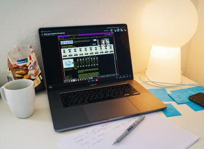
Testing, unlike auditing, cannot be done by one person. It involves users of assistive technologies and comprises a set of one-on-one sessions facilitated by a designer, UX researcher, or another professional.
Today we’ll focus on testing as an undervalued yet powerful method.
1.2. Usability vs. Accessibility Testing
You might have already heard about usability testing or even tried it. No wonder it’s the top research method among designers. So how is it different from its accessibility counterpart?
Common features:
- Script
In both cases, a facilitator prepares a full written script with an introduction, questions, and tasks based on a realistic scenario (for example, buying a ticket or ordering a taxi). By the way, here are handy testing script templates. - Insights gathering
Despite accessibility testing’s main focus, it also reveals lots of usability issues, simply said, whether a site or app is easy to use. In both cases, a facilitator should ask follow-up questions to get an insight into people’s way of thinking, pain points, and needs. - Format
Both testing types can be organized online or offline. Usually, one session takes from 30 minutes to 1 hour.
Key differences:
- Participants selection
People for usability testing are recruited mainly by demographic characteristics: job title, gender, country, professional experience, etc. When you test accessibility, you take into account the senses and assistive technologies involved in using a product. - What you can test
In usability testing, you can test a live product, an interactive prototype (made in Figma, Protopie, Framer, etc.), or even a static mockup. Accessibility testing, in most cases, requires a live product; prototyping tools cannot deliver a source code compatible with assistive technology. Figma attempted to make prototypes accessible, but it’s still far from perfect. - Giving hints
When participants get stuck in the flow, you help them find the way out. But when you involve people with disabilities, you have to understand how their assistive gear works. Just to give you an example, a phrase like “Click on the red cross icon in the corner” will sound silly to a blind user.
1.3. Why Opt For Testing?
Now that you know the difference between an audit and testing and the distinction between usability and accessibility testing, let’s clarify why testing is so powerful. There are two reasons:
- Get valuable insights.
The idea of testing is to learn how you can improve the product. While you won’t check all interface elements and edge cases, such sessions show if the whole flow works and if people can reach the goal. Unlike even the most comprehensive audits, testing is much closer to reality and based on the usage of real assistive technology by a person with a disability. - Build empathy through storytelling.
A good story is more compelling than bare numbers. Besides, it can serve as a helpful addition to such popular pro-accessibility arguments as legal risks, winning new customers, or brand impact. Even 1–2 thorough sessions can give you enough material for a vivid story to excite the team about accessibility. An audit report alone may not be as thrilling to read.
Testing gives you more realistic insights into common scenarios. Laws and standards aren’t perfect, and formal compliance might not cover all the user challenges. Sometimes people take not the “designed” path to the goal but the one that seems safer or more intuitive, and testing reveals it.
Of course, auditing is still a powerful method; however, its combination with testing will show much more accurate results. Now, let’s talk about accessibility testing in detail.
Part 2. Recruiting Users
There are many types of disabilities and, consequently, various assistive technologies that help people browse the web. Without a deep dive into theory, let’s just recap the variety of disabilities:
- Depending on the senses involved or the affected area of life: visual (blindness, color deficiency, low vision), physical (cerebral palsy, amputation, arthritis), cognitive (dyslexia, Down syndrome, autism), auditory (deafness, hearing loss), and so on.
- By severity: permanent (for example, an amputated leg or some innate condition), temporary (a broken arm or, let’s say, blurred vision right after using eye drops), and situational (for instance, a noisy room or carrying a child).
Note: You can find more information on various types of disabilities on the Microsoft Inclusive Design hub.

For the sake of simplicity, we’ll focus on the case applicable to most digital products: when a site or app mostly relies on vision. In this case, visual assistive technologies offer users an alternative way to work with content online. The most common technologies are:
- Screen readers: software that converts text into speech and has numerous handy shortcuts to navigate efficiently. (We’ll talk about it in detail in the next chapters.)
- Refreshable Braille displays: devices able to show a line of tactile Braile-script text. Round-tipped pins are raised through holes in a surface and refresh as a user moves their cursor on the screen. Such displays are vital for blind-deaf people.
- Virtual assistants (Amazon Alexa, Apple Siri, Google Assistant, and others): an excellent example of universal design that serves the needs of both people with disabilities and non-disabled people. Assistants interpret human speech and respond via synthesized voices.
- High-contrast displays or special modes: for people with low vision. Some users combine a high-contrast mode with a screen reader.
2.1. Who To Involve
Debates around an optimal number of testing participants are never-ending. But we are talking here about a particular case — organizing accessibility testing for the first time, hence the recommendation is the following:
- Invite 3–6 users with blindness and low vision who either browse the web by means of screen readers or use a special mode (for example, extra zoom or increased contrast).
- If your product has rich data visualization (charts, graphs, dashboards, or maps), involve several people with color blindness.
In any case, it’s better to conduct even one or two high-quality sessions than a dozen of poorly prepared ones.
2.2. Where To Find People
It is not as hard to find people for testing as it seems at first glance. If you are working on a mass product for thousands of users, participants won’t need any special knowledge apart from proficiency with their assistive technology. Here are three sources we recommend checking:
- Specialized platforms for recruiting users according to your parameters (for example, Access Works or UserTesting). This method is the fastest but not the cheapest one because platforms take their commission on top of user compensation.
- Social media communities of people with disabilities. Try searching by the keywords like “people with disabilities,” “PWD,” “support group,” “visually impaired,” “partially sighted,” or “blind people.” Ask the admin’s permission to post your research announcement, and it won’t be rejected.
- Social enterprises and non-profits that work in the area of inclusion, employment, and support for people with disabilities (for example, Inclusive IT in Ukraine or The Federation of the Blind and Partially Sighted in Germany). Drop them an email with your request.
We noticed that the last two points might sound like getting participants for free, but not everyone has an opportunity to volunteer.
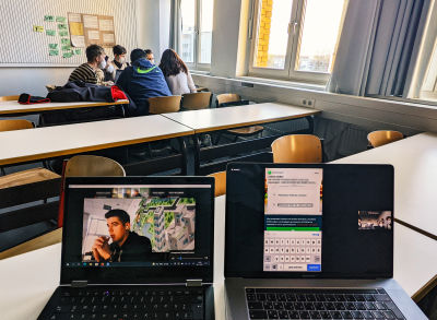
When we organized accessibility testing sessions last year, three persons agreed to take part pro bono because it was a university course, and we didn’t get any profits. Otherwise, be ready to compensate for the participant’s time (in my experience, around €15–30). It can be an Amazon gift card or coupon for something useful in a particular country (only ensure it’s accessible).
Digital product companies that test accessibility regularly hire people with disabilities so that they have access to in-progress software and can check it iteratively before the official launch.
Part 3. Preparing For The Session
Now that you’ve recruited participants, it’s time to discuss things to prepare before the sessions. And the first question is:
3.1. Online Or offline?
There are basically two ways to conduct testing sessions: remotely or face-to-face. While we usually prefer the first one, both techniques have pros and cons, so let’s talk about them.
Benefits of online:
- Native environment.
Participants can use familiar home equipment, like a desktop computer or laptop, with nicely tuned assistive technology (plugins, modes, settings). - Cost and time efficiency.
No need to reimburse expenses for traveling to your office. It might be quite costly if a participant arrives with an accompanying person or needs special accessible transport. - Easier recruitment.
It’s more likely you’ll find a participant that meets your criteria around the world instead of searching in your city (and again, zero travel expenses).
Benefits of offline:
- Testing products in development.
If you have a product that isn’t public yet, participants won’t be able to easily install it or open it in a browser. So, you’ll have to invite participants to your office, but they should probably bring the portable version of their assistive technology (for example, on a USB drive). - Testing mobile apps.
If a person brings a personal phone, you’ll see not only the interaction with your product but also how the device is set up and what gestures and shortcuts a person uses. - Helping inexperienced users.
Using assistive technology is a skill, and you may involve someone who is not yet proficient with it. So, the offline setting is more convenient when participants get stuck and you help them find the way out.
As you can see, online testing has more universal advantages, whereas the offline format rather suits niche cases.
3.2. Communication Tools
Once you decide to test online, a logical question is what tool to choose for the session. Basically, there are two options:
Specialized testing tools (for instance, UserTesting, Lookback, UserZoom, Hotjar, Useberry):
- Apart from basic conferencing functionality, they support advanced note-taking, automatic transcription, click heatmaps, dashboards with testing results, and other features.
- They are quite costly. Besides, trial versions may be too limited for even a single real session.
- Participants may get stuck with an unfamiliar tool that they’ve never used before.
Popular video conferencing tools (for example, Google Meet, Zoom, Microsoft Teams, Skype, Webex):
- Support all the minimally required functionality, such as video calls, screen-sharing, and call recording.
- They are usually free.
- There is a high chance that participants know how to use them. (Note: even in this case, people may still experience trouble launching screen-sharing).
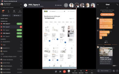
Since we are talking about your first accessibility testing, it’s much safer and easier to utilize an old good video conferencing tool, namely the one that your participants have experience with. For example, when we organized educational testing sessions for the Ukrainian Catholic University, we used Skype, and at the HTW University in Berlin, we chose Zoom.
Regardless of the tool choice, learn in advance how screen-sharing works in it. You’ll likely need to explain it to some of the participants using suitable (non-visual) language. As a result, the intro to accessibility testing sessions may take longer compared to usability testing.
3.3. Tasks
As we figured out before, accessibility testing requires a working piece of software (let’s say, an alpha or beta version); it’s harder to build, but it opens vast research opportunities. Instead of asking a participant to imagine something, you can actually observe them ordering a pizza, booking a ticket, or filling in a web form.
Recommendations for accessibility testing tasks aren’t much different from the ones in usability testing. Tasks should be real-life and formulated in a way people naturally think. Instead of referring to an interface (what button a person is supposed to click), you should describe a situation that could happen in reality.
Start a session with a mini-interview to learn about participants’ relevant experiences. For example, if you are going to test an air travel service, ask people if they travel frequently and what their desired destinations are. Based on these details, customize the tasks — booking a ticket to the place of the participant’s choice, not a generic location suggested by you.
Examples of realistic, broad tasks:
- Testing a consumer product: bicycle online store.
You want to buy a gift card for your colleague George who enjoys bikepacking. Choose the card value, customize other preferences, and select how George will receive the gift. (This task implies that you learned about a real George who likes cycling during a mini-interview.) - Testing a professional product: customer support tool.
Your manager asked you to take a look at several critical issues that haven’t been answered for a week. Find those tickets and find out how to react to them. (This task implies that you invited a participant who worked as a customer support agent or in a similar role.)
Examples of leading UI-based tasks:
- Consumer product
“Open the main menu and find the ‘Other’ category. Choose a €50 gift card. In the ‘For whom’ input field enter ‘John Doe’… Select ‘Visa/Mastercard’ as a paying method…” - Professional product
“Navigate to the dashboard. Choose the ‘Last week’ option in the ‘Status’ filter and look at the list of tickets. Apply the filter ‘Sort by date’ and tell me what the top-most item is…”
A testing session is 50% preparation and 50% human conversation. It’s not enough to give even a well-formulated task and silently wait.
An initial task reveals which of the ways to accomplish a task a participant will choose as the most intuitive one. When a person gets stuck, you can give hints, but they shouldn’t sound like “click XYZ button”; instead, let them explore further. Something like the following:
— No worries. So, the search doesn’t give the expected result. What else can you do here?
— Hmm, I don’t know. Maybe filtering it somehow…
— OK, please try that.
3.4. Wording
Your communication style impacts participants’ way of thinking and the level of bias. Even a huge article won’t cover all the nitty-gritty, but here are several frequent mistakes.
Beware of the following:
- Leading tasks: “Go to the ‘Dashboard’ section and find the frequency chart” or “Scroll to the bottom to see advanced options.”
Such hints totally ruin the session, and you will never know how a person would act in reality. - Selling language: “Check our purchase in one click” or “Try the ‘Smart filtering’ feature.”
It makes people feel as if they have to praise your product, not share what they really think. - Humorous tasks: “Create a profile for Johnny Cash” or, for example, “Request Christmas tree delivery to Lapland.”
Jokes distract participants and decrease session realism. - IT terminology: “On the dashboard, find toggle switch” or “Go to the block with dropdowns and radio buttons.”
It’s bad for two reasons: you may confuse people with words they don’t understand; it can be a sign that you give leading tasks and excessive UI hints.
Here is recommended further reading by Nielsen Norman Group:
Part 4. Session Facilitation
As agreed before, your first accessibility testing session will probably involve a blind person or a person with low vision who uses a screen reader to browse the web. So, let’s cover the two main aspects you have to know before starting a session.
4.1. Screen Readers
A screen reader is an assistive software that transforms visual information (text and images) into speech. When a visually impaired person navigates through a site or app using a keyboard or touchscreen, the software “reads” the text and other elements out loud.
Screen readers rely on the source code but interpret it in a special way. They skip code accountable for visual effects (like colors or fonts) and take into account meaningful parts, such as heading tags, text descriptions for pictures, and labels of interactive elements (whether it’s a button, input field, or checkbox). The better a code is written, the easier it will be for users to comprehend the content.
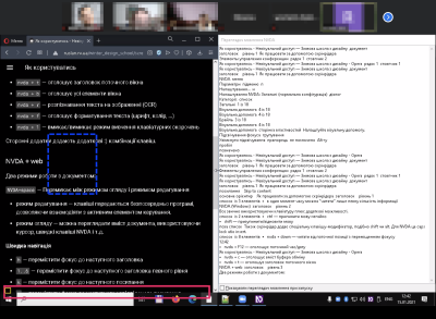
Now that you know how screen readers function, it’s time to experience them firsthand. Depending on the operating system, you’ll have a standard embedded screen reader already available on your device:
- VoiceOver: Mac and iOS;
- Narrator: Windows;
- TalkBack: Android.
During one of our training courses, we learned from blind users that the screen reader on iPhone is more comfortable and flexible than the Android one. Interestingly, people don’t like standard desktop screen readers either on Mac or on Windows and usually install one of the advanced third-party readers, for instance:
- JAWS (Job Access With Speech): Windows, paid, the most popular screen reader worldwide;
- NVDA (Non-Visual Desktop Access): Windows, free of charge.
4.2. Navigation
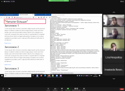
Visually impaired people usually navigate apps and sites using a keyboard or touchscreen. And while sighted people scan a page and jump from one part to another, screen reader users can keep only one element in focus at a time, be it a paragraph of text or, let’s say, an input field.
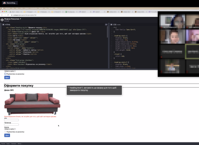
Participants of your accessibility testing will likely run into an unpassable obstacle at some point in the session, and you’ll give them hints on how to find the way out and proceed with the next task. In this case, you’ll need a special non-visual language that makes sense.
Not helpful hints:
- “Click the cross icon in the upper right corner.”
- “Scroll to the bottom of the modal window and find the button there.”
- “Look at the table in the center of the page.”
Helpful hints:
- “Please, navigate to the next/previous item.”
- “Go to the second element in the list.”
- “Select the last heading/link/button.”
Note: UI hints above are suggested for cases when a user is completely stuck in the flow and cannot proceed, for example, when an element is not navigable via a keyboard or, let’s say, an interactive element doesn’t have a proper label or name.
Summary
Once all the testing sessions have been completed, you can analyze the collected feedback, determine priorities, and develop an action plan. This process could be the subject of a separate guideline, but let’s cover the three key principles right away:
- Catching information
Testing produces tons of data, so you should be prepared to capture it; otherwise, it will be lost or obscured by your imperfect human memory. Don’t rely on a recording. Make notes in the process or ask an assistant to do that. Notes are easier to analyze and find repeating observations across sessions. Besides, they ensure you’ll have data if the recording fails. - Raw data ≠ insights
Not everything you observe in testing sessions should be perceived as a call to action. Raw data shows what happened, while insights explain reasons, motivations, and ways of thinking. For example, you see that people use search instead of filters, but the insight may be that typing a search request needs less effort than going through the filter menu. - Criticality and impact
Not all observations are significant. If five users struggle to proceed because the shopping cart isn’t keyboard-navigable, it’s a major barrier both for them and the business. But if one out of five participants didn’t like the button name, it isn’t critical. Take into account the following:- How many participants encountered a problem;
- How much a problem impacts reaching the goal: booking a ticket, ordering pizza, or sending a document.
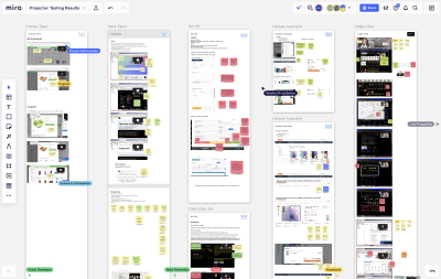
Once the information has been collected and processed, it is essential to share it with the team: designers, engineers, product managers, quality assurance folks, and so on. The more interactive it will be, the better. Let people participate in the discussion, ask questions, and see what it means for their area of responsibility.
As you gain more experience in conducting testing sessions, invite team members to watch the live stream (for instance, via Google Meet) or broadcast the session to a meeting room with observers, but make sure they stay silent and don’t intrude.
Further Reading

(vf, gg, yk, il)


